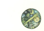
 This is really disappointing. The scan is awful. The original looks so much better. I painted the bell with some bronze ink and on the original it looks really good. It just doesn't work on the scan. It looks flat and the colour is very very dull. I have a feeling this post is really going to annoy me. It looks better HERE.
(Check out my EveryDayMatters set so far HERE)

14 comments:
Andrea, this is so nice!!! I love it!!! Very well done!!!
r word for this not being as good as the original, but in that case the original must be gorgeous a this is ... BRILLIANT! The detail on the embroidery and that fringe are wonderful.
Somehow I managed to chop off the beginning of the previous paragraph ... It's supposed to say: I'll take your word ... :)
OMG!!! I thought it was a photo. That fringe in incredible!!!
Now, Andrea, this bell is gorgeous, so the scan doesn't do it justice, but we love it! The yarn and mebroidery are superb, and the colour is wonderful, so good job all around!
doesnt it drive you crazy how it dulls the colors..you are right the second looks AWESOME...great job...ALOT of fine work...
This color drawing is exquisite. In the close-up, the bronze body of the bell is so finely wrought...so dimensional.
I can here it ring from here.
Thank you all.
I am happy with the yarn but it's just the rest of it that I have my doubts about - especially the bell!
Cheers for visiting and your kind words guys.
Andrea, it looks gorgeous from here, but I can see the first one, the close up, being much better in showing the fine textures. I lovely rendition of a beautiful object.
I find the same problem with scans losing so much.I've had better luck taking photos of the drawings, then using photoshop to crop and orient. Of course the pixel count too makes such a difference.
I really love your art. Thank you for sharing.
~Ashleigh
oops! I meant to say the second one, the enlarged. "slaps head"
You prove to us how all kinds of articles can be used for super pictures.
How large are your pics?
Re the scanning - I find that the program I use brightens the colours when I want to make them soft and subtle!
w.
Is that yarn around the top? That is so fantastically detailed it looks photorealistic. Beautiful work!
WOW! It looks pretty darned good on my monitor screen, Andrea ~ exquisite job!
No matter what way I look at it, it is just plain GORGEOUS!!!!
Post a Comment